Putting People First: Inclusive Design & Website Accessibility

Imagine if you tried to access a website but could not understand the content, see the images, or quickly find the information you are looking for. Would you be frustrated? Leave the site and find one easier for you to navigate and understand? The answer to both is likely a yes.
For millions of people in the United States and worldwide, this happens daily on websites not built with a people-first approach. On sites that don’t follow ADA guidelines or use inclusive website design methods. However, we can change this by creating websites and digital experiences accessible to a broader community with planning, intentionality, and education.
The good news is that inclusive and ADA-compliant websites are often more appealing and engaging for all users. Contrary to popular belief, they are not more expensive or difficult to create than websites without accessibility in mind.
How do you put people first in web design? It’s important first to understand the differences and similarities between inclusive and accessible website design.
Inclusive Design vs. Website Accessibility
Inclusive design and website accessibility get used interchangeably. While there is overlap, there are differences between the two. Inclusive design is the process of focusing on creating engaging and varying ways for users to interact with a website, regardless of age, ability, and circumstance. Website accessibility is a component of inclusive design and has set guidelines that consider the physical and cognitive abilities of the user.
Sound confusing? Let’s dive in a little more.
Inclusive Design is a Process

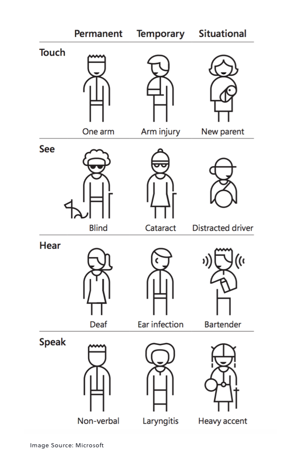
Inclusive web design is about engaging authentically with a user while recognizing diversity and uniqueness. It considers physical barriers and the of diversity of the user – ability, language, culture, environment, age, and other differences, whether they be permanent, temporary, or situational.
An inclusive design methodology incorporates various perspectives and backgrounds to create a welcoming product for all users. It’s a change of perception and a shift in mindset. Rather than designing from their singular perspective and experiences, UX designers approach a project with an all-encompassing strategy to remove any exclusion.
When UX designers create a website using an inclusive design process, they are working with the simple principle that designing for the broadest range of people makes better designs and benefits everyone.
A closed-captioned video on a website designed for someone who is deaf also benefits a user with an ear infection or a person on a noisy, crowded subway who forgot their headphones.
Website Accessibility Follows Guidelines
Website Accessibility, a component of inclusive design, focuses more on removing barriers for the user and meets legal requirements set by the Americans with Disabilities Act (ADA). While you are likely familiar with ADA requirements for physical locations like ramps at store entrances, or braille menus at a restaurant, the ADA also extends into the digital world.
In 2010, the Department of Justice passed the ADA Standards for Accessible Design, requiring electronic information, including websites, to be accessible to those with disabilities such as vision impairment and hearing loss.
As a website owner, how can you create an accessible website and put people first? While the ADA does not define clear guidelines, many businesses – including Mile6 – follow the Web Content Accessibility Guidelines (WCAG).
What are WCAG Accessibility Standards?
The WCAG is a series of guidelines developed by the World Wide Web Consortium (W3C) to improve website accessibility and usability for people with disabilities. First developed in 1999 as WCAG 1.0, the guidelines have evolved to WCAG 2.1 and include four guiding principles for ADA website design: Perceivable, Operable, Understandable, and Robust.
 Perceivable:
Website accessibility assumes people need to be able to perceive web content so they can understand it. All forms of communication or information, including the Internet, are understood using one of the body’s five senses. Website users rely on sight, hearing, and in some cases, touch (we still haven’t figured out a way to use smell and taste but wouldn’t that be interesting?).
The information on a website must be perceivable by a user in a way they can access it. In other words, the information on the website can’t be “invisible” because of their disability. Accessible websites should consider each of the primary senses to provide the best user experience:
- Sight: People with full vision are generally able to perceive most websites. Using text, images, and visual cues, they can easily navigate and “see” the website. For the visually impaired or blind, though, websites can be hard to perceive. Using alt-tags for images or captions for multimedia can help users perceive the content. Contrasting colors and text sizes can also assist the visually impaired with perception. Assistive technologies such as screen readers can help a visually impaired user, but only if the website is designed with accessibility as a goal.
- Hearing: Audio content on a website should be closed-captioned for deaf users and people with temporary hearing loss to perceive the content. Other ways to make content accessible are using visual alternatives like charts, graphs, or other text. When creating new audio content, think about accessibility during planning, scripting, and recording.
- Touch: While touch is not a primary form of perception and communication, users who have neither sight nor hearing rely on touch to understand information. Web-Braille is a delivery system that relays content to a Braille embosser. Content flow on a website can impact how the content is converted into a Braille embosser, so be sure to present content in a streamlined, structured format for easy conversion.
 Operable:
Users should have the ability to interact with a website in the way that works best for them. For example, can someone navigate the website with their keyboard rather than use a mouse or a touch screen? The website interface should be operable for users with different abilities.
Other areas of focus for operability include:
- Time-Limit Controls: Users with motor disabilities may take longer than other users to perform a task or an operation on a website. Whenever possible, give users an unlimited amount of time to complete a form, read information, or complete another task that requires data entry or interaction. Users should also be able to control media such as video. Media players should have pause, rewind, and replay functions to assist users with operation.
- Error Recovery: Accidents happen, and websites should be forgiving. Users with reduced motor skills may accidentally click on an item they didn’t intend to purchase and should be able to fix their error easily. Web developers should consider building “second chances” into their websites to allow for easy error recovery.
- Clear, Organized Layout: Content hierarchy, or how the information is organized on a website, allows users to navigate and operate a website. Clear titles, content headings, and navigation items like menus, links, and buttons should be easily identifiable and distinguishable from each other.
 Understandable:
Have you ever landed on a website that was beautifully designed (perceived) and functioned as expected (operable) but got confused by the content? Complex content is a barrier to understanding. Language and word choice should be as simple and concise as possible for the content. For complicated topics, consider adding supplemental graphics or media that helps users understand or comprehend the content.
Good functionality is also a component of understandability. When possible, navigation should be predictable and consistent and offer the user an easy way to understand how to complete a task or complete their journey through the website.
 Robust:
Technology changes rapidly, and not all users opt for the same technology to use the Internet. Some users may have older browsers; others may use adaptive technologies. All users, though, expect a website to work using their technology preferences.
Different devices and technology available can be a challenge for website developers as it’s hard to develop a site for all users’ technologies. It’s important to develop a site to meet the broadest technology needs possible. During website planning and development, set a baseline for requirements that are not too restrictive and focus on future technologies and solutions.
One of the other pieces to know about WCAG is there are different levels of compliance – A (lowest), AA (mid-range), and AAA (highest). Essentially the more A’s – the more compliant you are with accessibility guidelines and the more in-depth the accessibility requirements.
Inclusive Design & Website Accessibility is More than ADA Compliance
Website accessibility and inclusivity are more than legal compliance. To us, accessibility and inclusivity are at the foundation of being socially and ethically responsible. A website designed with inclusivity tells customers you put people first and want all individuals to have a meaningful website experience regardless of abilities.
As a website owner, how can you use this information to achieve an inclusive and accessible website? If you already have a website, you can use tools like WebAIM to scan your website for content errors. If you’re starting a new design, make sure your design and development team follow accessibility standards.
Sources:
ADA.gov: ADA Standards for Accessible Design, Bureau of Internet Accessibility: Accessibility vs. Usability vs. Inclusion, Chrome Dev Summit 2020: Web Fundamentals – Accessibility, Corporate Compliance Insights: The True Cost of Website Inaccessibility, Digital.gov: Eight Principles of Mobile-Friendliness, Microsoft: Inclusive Design, Toptal: Accessible Design vs Inclusive Design (with Infographic), Usability,gov: Accessibility Basics, W3C WAI: Accessibility, Usability, and Inclusion, W3C WAI: Web Content Accessibility Guidelines (WCAG) 2.1, W3C WAI: Web Content Accessibility Guidelines Overview, WebAIM: Introduction to Web Accessibility, WebAIM: WAVE Web Accessibility Evaluation Tool

 Perceivable:
  Operable:
  Understandable:
  Robust: